
Community Manager
July 15, 2025
FEATURE UPDATE

Boost productivity and focus with a new reimagined inbox
Related products:StarterProfessionalEnterprise
  • July 15, 2025
  • 75 replies
  • 4647 views
Boost productivity and focus with a new reimagined inbox

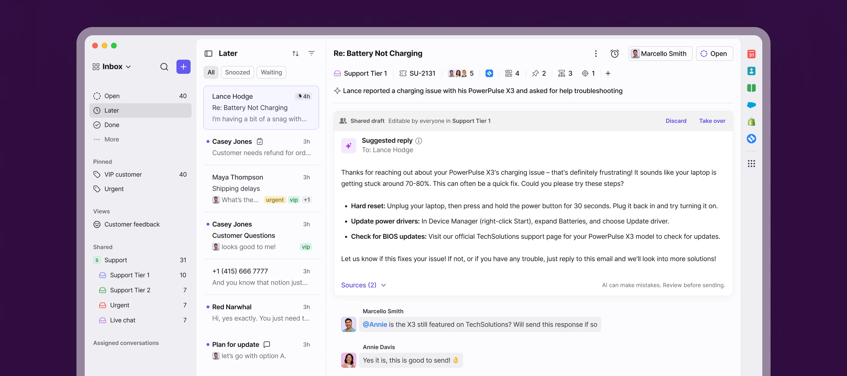
We’re launching a new, streamlined inbox experience to simplify daily workflows and keep your team focused with clearer prioritization and faster context.

Here’s what’s new:

  • Open, Later, and Done sections bring order to your queue
  • Simplified conversation header gives you context at a glance
  • Collapse your sidebar to get into "focus mode"
  • Speed through your inbox with more discoverable shortcuts

Join the beta group for inbox design updates and help shape the inbox experience.

    75 replies

    meganbeatty
    Fronteer
    July 16, 2025

    Thank you ​@meganbeatty , but in “Later” or “Done” section it's not possible to distinguish the Discussions section, like you can in “Open”. Is there a way to filter discussions in “Later” or “Done”?


    Currently, there isn’t a way to filter for discussions in the Later of Done sections - this is something we are currently discussing internally however! 

    Conversationalist
    July 16, 2025

    Tags don’t have enough contrast when there is an unread email under that tag. For example the following tags PayPal and Wise have an unread email and the text is in bold but the colour contrast is really bad compared to the rest tags that do not have an unread email. 


    The PayPal and Wise text in bold hex color is: #f3f2f7 

    The Stripe, Invoices tags text in normal hex color is: #e4e3e8 


    The Old Interface has much better contrast. Here is how it looks in the old interface:


    The PayPal and Wise text in bold hex color is: #eeedf2

    The Stripe, Invoices tags text in normal hex color is: #a5a4a8


    Please fix this.

    mkwp
    Conversationalist
    July 16, 2025

    I am finding it hard to believe that any power users of this product would find these changes beneficial. It’s less efficient (more clicks, less intuitive location for search, etc) and visually very messy

    jett
    Conversationalist
    July 17, 2025
    The color at the tip of the ticket that indicates which channel the conversation came from is also gone in the new UI which makes it hard to merge tickets.


    Sylvia
    Conversationalist
    July 17, 2025

    I use Front on a desktop and it’s very hard to see and distinguish anything now. At least make new messages really stand out like previously. And put the delete icon back in the ribbon. It’s not something we should have to go hunting for. 

    emely_pieper
    Conversationalist
    July 17, 2025

    New messages are basically not visible. It may look sleeker to you (or streamlined) but honestly for visually impaired people, anyone who is sensitive to lights and just any glasses user it is very hard to distinguish anything now. The boldness of new unread messages is sooooo important. Please bring it back or at least make themes more adjustable. 

    michel
    Conversationalist
    July 17, 2025

    Hi there,

    Will we be able to customize the ribbon/toolbar at all? I’m frustrated that the trash and tag buttons are now nested within dropdown menus. Some other commenters have touched on this already. The ability to add additional items to this empty space would be fantastic.


    And I just want to add, it seems to me that your team mistook a clean design for an efficient/convenient one, as so often happens with redesigns. I appreciate that the new inbox may be a great improvement for some, but for others (myself included) it just seems that certain features were sacrificed in the name of an attractive UI.

    This. I don’t like it that features I use a lot are now more clicks away than before. Opening the calendar, adding a tag, creating a message or deleting a conversation now takes more clicks than before. That’s not convenient. And yes, I know the shortcuts.

    The fact that my colleagues had to ask someone where the search function was, is another example. You search in your conversations, so you expect this function to be above the conversations. Where it was in the old interface. Not in the sidebar.

    “Design is not just what it looks like and feels like. Design is how it works.”

    allison_mccormick2
    Conversationalist
    July 17, 2025

    In the old screen, I had emails coming in from my Parabola flow, moving to another “folder” to keep my inbox cleansed up and be able to access the Parabola emails when I needed them .  In the new screen, they are all together and i cannot find my old folders i had set up for these things to move to - they show up in my inbox - how do i fix this?


    samsheridan
    Helper
    July 17, 2025

    So many important buttons and context were buried, and yet we have two settings buttons, one at the top in the navigation menu and one at the bottom of the sidebar.

    smalone
    Conversationalist
    July 17, 2025

    I’d like to echo the sentiment of other users on this thread. In a effort to simplify the layout, Front has added complexity and confusion to what were previously efficient workflows. 

    Here are my team’s primary concerns:

    1. Dynamic Objects/Links now require an extra click to view, making it harder to reference key information directly in the email body.
    2. Colored Flags are no longer visible in the email preview corner, making it harder to quickly identify which inbox an email belongs to.

    3. The overall look feels dated and more aligned with Outlook, which contrasts with the modern, clean interface we appreciated in the previous version.

    4. It’s difficult to see when new emails arrive, which makes staying on top of time-sensitive messages more challenging.

    5. The search bar is no longer persistent in the top navigation and is now tucked away, which adds friction to a task we do frequently.
    6. The addition of "done" and "later" feels unnecessary and is inconsistent with the prior naming convention (snoozing and archiving) that made managing a Front inbox so efficient. 

    Requiring extra clicks for routine tasks adds up and leads to significant time wasted over the course of a day. 

    We previously loved using Front, but the new interface now feels tedious and uninspired. I’m hopeful that the previous inbox layout will be revisited as it was the best thing about Front!