
Community Manager
July 15, 2025
FEATURE UPDATE

Boost productivity and focus with a new reimagined inbox
Related products:StarterProfessionalEnterprise
  • July 15, 2025
  • 75 replies
  • 4647 views
Boost productivity and focus with a new reimagined inbox

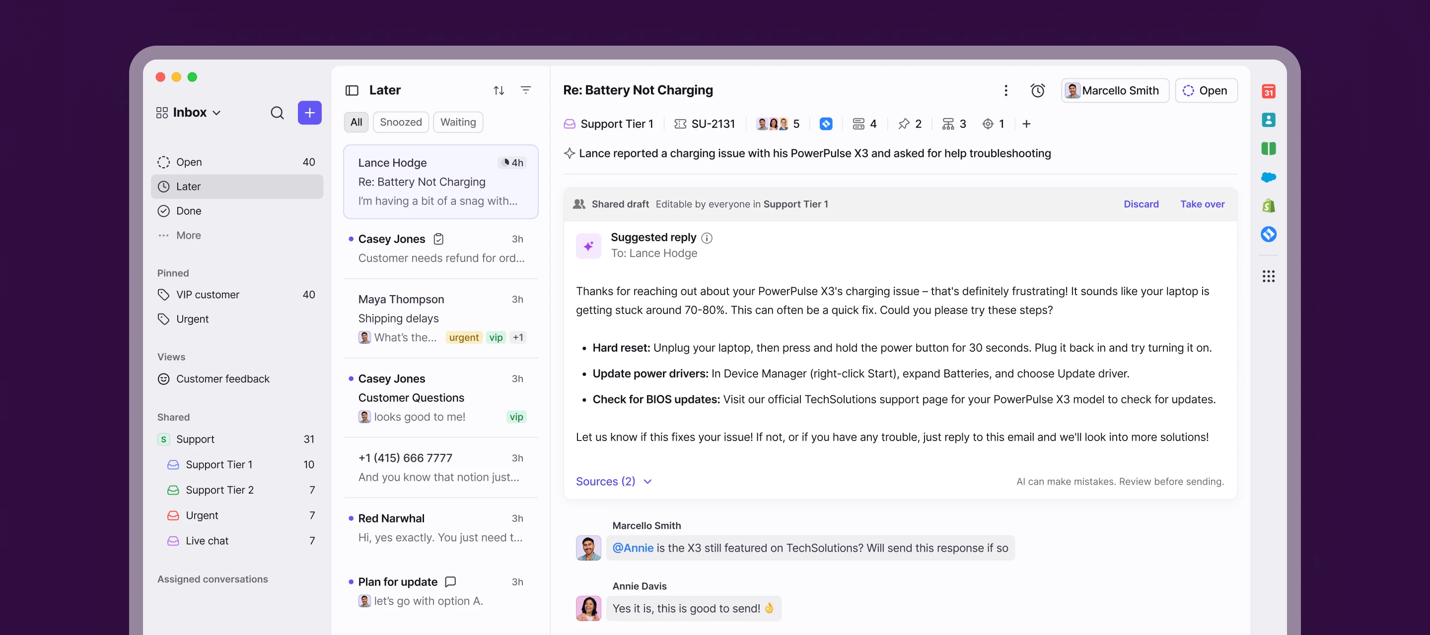
We’re launching a new, streamlined inbox experience to simplify daily workflows and keep your team focused with clearer prioritization and faster context.

Here’s what’s new:

  • Open, Later, and Done sections bring order to your queue
  • Simplified conversation header gives you context at a glance
  • Collapse your sidebar to get into "focus mode"
  • Speed through your inbox with more discoverable shortcuts

Join the beta group for inbox design updates and help shape the inbox experience.

    75 replies

    jen_shimp
    Conversationalist
    July 18, 2025

    We have been using “create linked conversation” and I don’t see that as an option anywhere in the new look. Am I missing something? This was an integral part of tracking and was a great feature when it launched. 

    Orianne
    Conversationalist
    July 21, 2025

    @jen_shimp to link a conversation you need to use the + sign next to the tags, above the email, if this is what you are talking about


    Stefan Schaefer
    Conversationalist
    July 21, 2025

    Hi

    Here's some feedback from our team, the general sentiment is that efficiency has not been put in the first place designing this new UI, which is unfortunate.

    • Bad contrast in dark mode (internal message and message from and to the client are hard to differentiate.

    • Discussions are now "hidden" have to search further back and especially to find back archived discussions. Would be great to have the discussion tab back.

    • In general have to click 2 or 3x times more than before.

    • Dynamic objects are now "hidden" in the header behind a small drop down menu, in the previous version this was more visible and better accessible

    • Archive of the private email inbox hard to find


    At the moment I’m unsure of how this new design will impact our daily operation. The need to make more clicks will definitely not help.

    Most users reverted back to the old version because of this.

    Conversationalist
    July 21, 2025

    Where did the “assigned to me” section go? How do I answer my customer’s chats/emails that are assigned to me? 

    Orianne
    Conversationalist
    July 21, 2025

    Hi ​@Front User 383, you can expand the open inbox, and you'll find the "assigned to me" section. It's not really visible right away when you change to the new UI.

    nate2024
    Conversationalist
    July 22, 2025

    I’ve been using the new layout since it launched last week, and I applaud the Front team coming up with this sleeker design. I have a few pain points that haven’t gone away as I’ve gotten used to it:

    • The lack of contrast in the list of emails in the inbox is a bit disorienting when things get busy. I have to take a moment to engage my brain to parse the list of emails, in a way I didn’t have to before, if that makes sense. I’d suggest a bolder line between emails or having a shaded outline of the preview (any number of other small changes might do the trick here).
    • The search button is smaller, so it requires more precision to click; this is a shame given how often my team uses search (because Front’s search is so helpful). I think I understand why this change was made: to make the inbox the “main event” and not take up screen real estate with a bigger bar. Still, I’d like the option to move it back to where it was.
    • Opening a new email draft now takes two clicks (I have to click the + symbol and then “Message”). My team doesn’t use any of the other options (Discussion, Talk, Call), so this is purely downside for us. I’d suggest that if you disable three of the options, the + button automatically opens up the one remaining (in our case, opens a new message) -- or just have a bigger “New draft” button as before.
    Joe Lopez
    Conversationalist
    July 22, 2025

    Was it intentional to remove the ability to see if discussions are assigned directly from the list view? In the previous interface we were able to see at a quick glance who was assigned to a conversation or a discussion. Within the new interface, only email conversations display who is assigned to it, but if the message is a discussion you have to select the message in order to see who is assigned to it. Would it be possible to display who is assigned to the conversations regardless of it being an email or a discussion?


    Conversationalist
    July 23, 2025

    Hi there,

    Will we be able to customize the ribbon/toolbar at all? I’m frustrated that the trash and tag buttons are now nested within dropdown menus. Some other commenters have touched on this already. The ability to add additional items to this empty space would be fantastic.


    And I just want to add, it seems to me that your team mistook a clean design for an efficient/convenient one, as so often happens with redesigns. I appreciate that the new inbox may be a great improvement for some, but for others (myself included) it just seems that certain features were sacrificed in the name of an attractive UI.

    +1 to this.  As a customer whose team leverages the tags feature quite a bit for tracking and categorizing work, nesting that option felt rude, and moving that and the  from the right to the left seemed like moving things just to move them.  It would be nice to have the option to decide what I want as 1st order access vs. adding clicks to every interaction (this adds up) or people needing to be sure to have right thing in focus for the hot-key to work vs. just adding an errant ‘t’ into an email or comment.  There’s plenty of real estate for a customizable toolbar there (same could apply to the inbox/caldendar/contacts etc. drop-down that used to be button/tabs).  

    Also, minor nit, but I’m sad to see the empty-inbox people go in favor of a comparatively sterile block stack.  The “personality” there was a nice touch as a reward for cleaning a plate.  

    lucas_m
    Conversationalist
    July 24, 2025

    Where is the “create linked task” option?!

    florian
    Conversationalist
    July 24, 2025

    I’ve been living with this ‘reimagined’ experience for a week now and I have nothing good to say about it. There’s less contrast and less shapes that could carry valuable information like color. Even unread messages are harder to see.

    Just give me a native Mac app instead of this Electron web app and I would be very very happy.