
Community Manager
July 15, 2025
FEATURE UPDATE

Boost productivity and focus with a new reimagined inbox
Related products:StarterProfessionalEnterprise
  • July 15, 2025
  • 75 replies
  • 4647 views
Boost productivity and focus with a new reimagined inbox

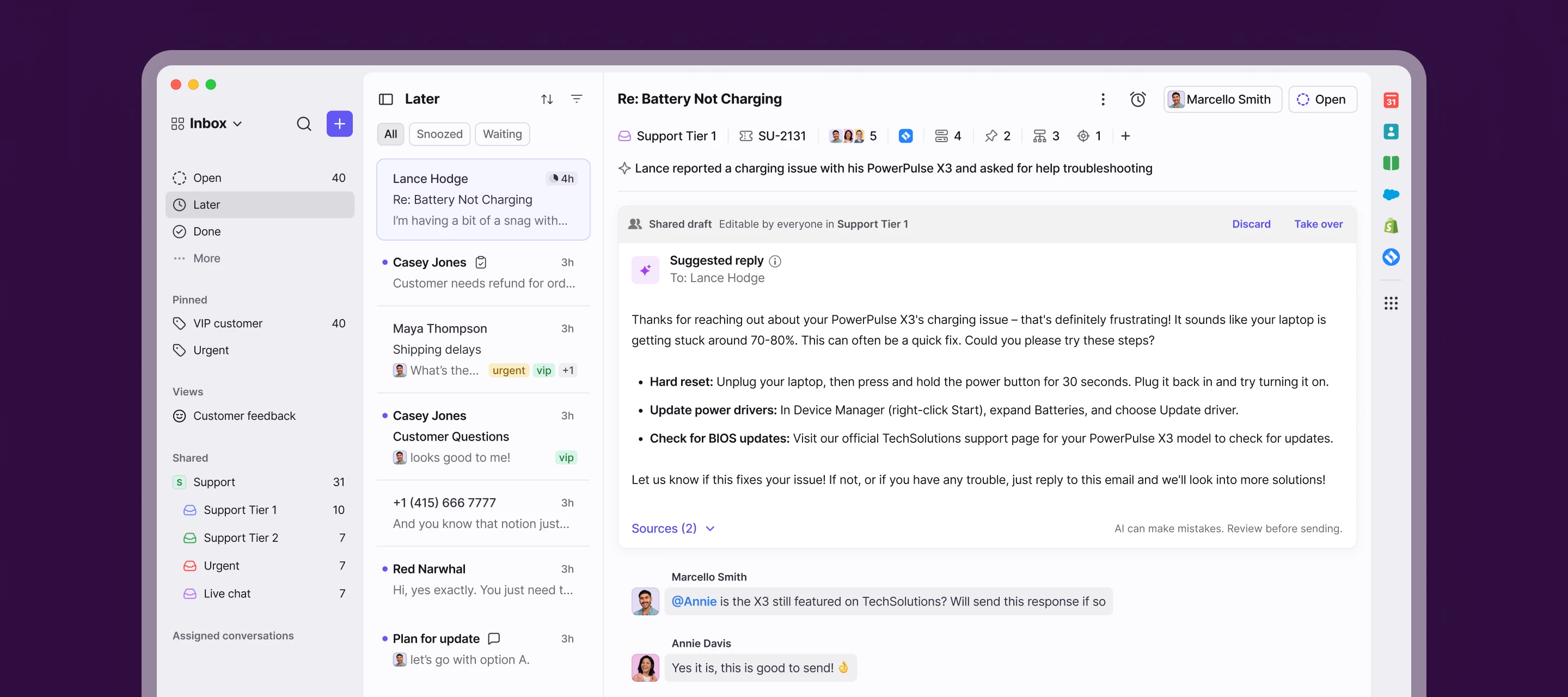
We’re launching a new, streamlined inbox experience to simplify daily workflows and keep your team focused with clearer prioritization and faster context.

Here’s what’s new:

  • Open, Later, and Done sections bring order to your queue
  • Simplified conversation header gives you context at a glance
  • Collapse your sidebar to get into "focus mode"
  • Speed through your inbox with more discoverable shortcuts

Join the beta group for inbox design updates and help shape the inbox experience.

    75 replies

    KAK3000
    Conversationalist
    August 15, 2025

    Why would incoming mail names look different/be truncated since the new UI?  How can we fix this?

    domclegg
    Conversationalist
    August 18, 2025

    I can’t get over how awful this new UI is.  It’s a sea of grey with far too much subtlety between zones. I actually used to enjoy going through my emails in the old UI, not anymore Please bring back the old version.

    EoLs
    Conversationalist
    August 28, 2025

    Horrible update, valuing aesthetics over efficiency and user-friendliness is a common
    and annoying trend. One gets the clear sense that the developers do not user
    Frontapp on a day-to-day basis, contrary to their customers…

    Many horrible choices:

    1) No contrast on unread messages make it much harder to see the unread
    messages

    2) Overall the UX is flat and uniform, making it harder to quickly locate
    things

    3) Many very common features now take an extra step/click to use (such as
    adding a tag)

    4) No dark sidebar theme

    5) No message count on threads??

    Revert it or fix this half-baked update!

    Conversationalist
    October 20, 2025

    Some feedback on the new UI:

    1. Too many clicks to find Assigned to Me & Archived. There should be an Archived tab. Seemingly the way to see this is to go to Done and add an Assigned To Me filter, which is a lot of clicks, especially when having to add/remove the Assigned to Me filter depending on what I’m looking for. Workaround is that I created a Private View to do this instead, but it used to be a core feature.
    2. Shared With Me feature removed - now this is Subscribed, which is fine, except for the same issue above; there is no Archived filter and I don’t know of a way to see Archived. Sometimes my tickets get reassigned when I’m OOO in Front and I want to see which of those were reassigned, determine if I need to take them back. I’m not sure how I can do this today without using the mobile app’s Shared With Me.
    3. Too many clicks to add a tag. I started using Ctrl + T instead which has been a fine replacement but it doesn’t seem necessary to have this action consolidated into a drop down menu with other features. We use tags on every email.
    4. Would love to have a toggle dark mode on/off in the menu that pops up when I click my profile picture. I use Dark Mode but when I take screenshots for documentation, I prefer light mode, and I switch between the two often.
    helena
    Community Manager
    November 10, 2025

    Hey everyone, since there has been lots of feedback around this topic, our team wanted to create a dedicated space for you all to share your thoughts around continued inbox design improvements. We’ve created a beta group in our community where we’ll share designs before they’re launched so that you can shape the features you want. We want to hear from you and to create the Front that is most valuable to you. 


    ➡️ Join the beta group here

    We’ve already started sharing designs here so jump in with your input! 

    Product Education Lead, Front