
Community Manager
July 15, 2025
FEATURE UPDATE

Boost productivity and focus with a new reimagined inbox
Related products:StarterProfessionalEnterprise
  • July 15, 2025
  • 75 replies
  • 4647 views
Boost productivity and focus with a new reimagined inbox

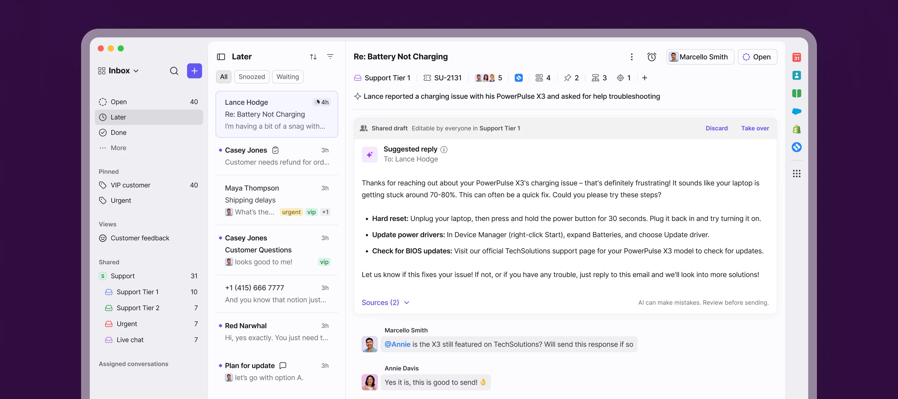
We’re launching a new, streamlined inbox experience to simplify daily workflows and keep your team focused with clearer prioritization and faster context.

Here’s what’s new:

  • Open, Later, and Done sections bring order to your queue
  • Simplified conversation header gives you context at a glance
  • Collapse your sidebar to get into "focus mode"
  • Speed through your inbox with more discoverable shortcuts

Join the beta group for inbox design updates and help shape the inbox experience.

    75 replies

    micahtcs
    Conversationalist
    August 6, 2025

    Really want to know from Front. Are you going to listen to your users and bring back the old UI? If you are sticking with this new version just let us know. So we can plan our move away from Front. 

    allenk
    Conversationalist
    August 6, 2025

    It appears that the ability to use the old UI was removed this week. This seems really fast, especially with all of the issues with the new UI. I know I submitted feedback directly, and never received a response on it. Our team has been struggling with this as well and causing disruptions in our workflow. I have been such a champion for Front in our org and other orgs, but this is making hard to really champion right now.

    JFucile
    Conversationalist
    August 7, 2025

    In no way has this update “boosted productivity.” It’s absolute trash. New features/tools are worthless if you can’t even navigate your inbox with ease. It took 3 team members 38 minutes today to find an archived discussion thread.

    How much to pivot back to the old format?

    Conversationalist
    August 7, 2025

    This update has been poorly thought out - the ability to send a new email should not require two clicks. It should be one - our core purposes on using Front is handling emails.

    It is extremely difficult to distinguish between read emails and unread emails which should not be the case - especially for users who are handling so many emails in a day it is painful.

    The ability to use the older interface should not be taken away until basic issues are resolved.

    hannah_tamplain
    Conversationalist
    August 8, 2025

    While I appreciate many of the updates, I have to agree there’s a stepdown in accessibility with the lessened contrast in the email previews. Everything is very flat and can be difficult for users who are dyslexic or attention issues. I would highly recommend the Front team consult with a company like Accessibe who provides web accessibility tools.

    meganbeatty
    Fronteer
    August 8, 2025

    Hi everyone - thanks for continuing to share your feedback with us - we appreciate your passion for Front and the examples you’ve shared about your own workflows. We wanted to share a few more updates on changes we’ve made or are shipping soon in response to feedback we’ve heard: 
     

     🚀 Feedback we've addressed/shipped:

    • Tag visibility: We now show more tags in the conversation list and the conversation header. (Shipped at GA)

    • Chat indicator: We've introduced a new chat indicator in P2 for prioritizing chats. (Shipped at GA)

    • Attachment icon: We've brought back the attachment indicator in the conversation list. (Shipped last week)

    • Message menu: We've flattened the 3 dot message menu making Resend/Fwd one-click actions. (Shipped last week)

    • Unread vs read: We've updated the bolding and color values for "unread" in the conversation list. (Shipped last week)

    • [NEW]Bulk actions:  We’ve reordered actions so the most used ones (like Assign) appear up front, with others behind the “more” menu. (Shipped last week) 

    • [NEW]Inbox filters: New filters in P2 to help find conversations across private and shared inboxes (Shipped last week)

    • [NEW]Assignee visibility: We’ve restored blue text and added last names to help quickly identify assignees in the conversation preview. (Shipped today)

     🚧 In progress:

    • [NEW] Conversations tab: The conversation list now has a tab just for your external conversations (i.e. a filtered view without Tasks or Discussions). (ETA: Next week)

    • [NEW] Subject line visibility in Conversation header: We’re extending the subject line to display up to 2 lines of text. (ETA: Next week)

    • [NEW] Email counter in conversation preview: We’ll now show the email message count starting at 5+ instead of 20+ (ETA: Next week)

    • [NEW] App objects in conversation header: We'll show 2 objects inline (similar to our tag UI) followed by a count if there is more than one object. (ETA: 2 weeks)

    • [NEW] Same tabs across Open/Later/Done: These sections will have the same tabs to easily find tasks, discussions, or conversations across any section. (ETA: 2 weeks)

    • [NEW] Bulk actions metadata: We're bringing back the ability to see the inbox and tags of bulk selected items (ETA: 2 weeks)

    • [NEW] Click-to-compose: We’re exploring a 1-click path to composing emails. (ETA: Q3)

    • [NEW]Mobile redesign: We're updating the mobile app to reflect the new inbox UI and navigation (ETA: Q3)

    • [NEW]Adding metadata in conversation header: We're making improvements to the "+" menu to help users quickly search/apply any tag, task, custom field, etc. without needing extra clicks. (ETA: Q3)

    smalone
    Conversationalist
    August 8, 2025

    Hi everyone - thanks for continuing to share your feedback with us - we appreciate your passion for Front and the examples you’ve shared about your own workflows. We wanted to share a few more updates on changes we’ve made or are shipping soon in response to feedback we’ve heard: 


    I appreciate that Front is making efforts to address the overwhelming amount of user feedback. However, making all of these updates to the new version so quickly seems to be like a complicated approach destined to cause more problems. 

    Wouldn’t the simplest solution be to revert back to the old version and enhance it from there? 

    It seems almost all customers are in favor of the old version. While I am “used” to the new version, I’ve yet to see any clearly defined benefits. Workflows are much slower and it is visually exhausting on the eyes.

    carrie.renick
    Conversationalist
    August 11, 2025

    Not a huge fan of the new inbox to be honest. I feel like everything is harder to see due to reduced contrast and everything more “squarish.” The biggest disadvantage and annoyance is that I feel like regular tasks take more clicks. Clicks = time & effort, the prior inbox was more effortless. It takes 2 clicks (and looking in the dropdown) to get to the calendar now, wheres before it took 1 click. Same thing with mass assigning emails. The search function is not intuitive and I feel like I have to “look” for it everytime. Give me the old version!!! 

    Conversationalist
    August 12, 2025

    please get back the older version

    asmirnov
    Conversationalist
    August 12, 2025

    Would it be possible to add an option to switch between the legacy version and the current one (not just on a trial basis)? To be honest, I haven’t found the new experience to be a positive one.