
Community Manager
July 15, 2025
FEATURE UPDATE

Boost productivity and focus with a new reimagined inbox
Related products:StarterProfessionalEnterprise
  • July 15, 2025
  • 75 replies
  • 4647 views
Boost productivity and focus with a new reimagined inbox

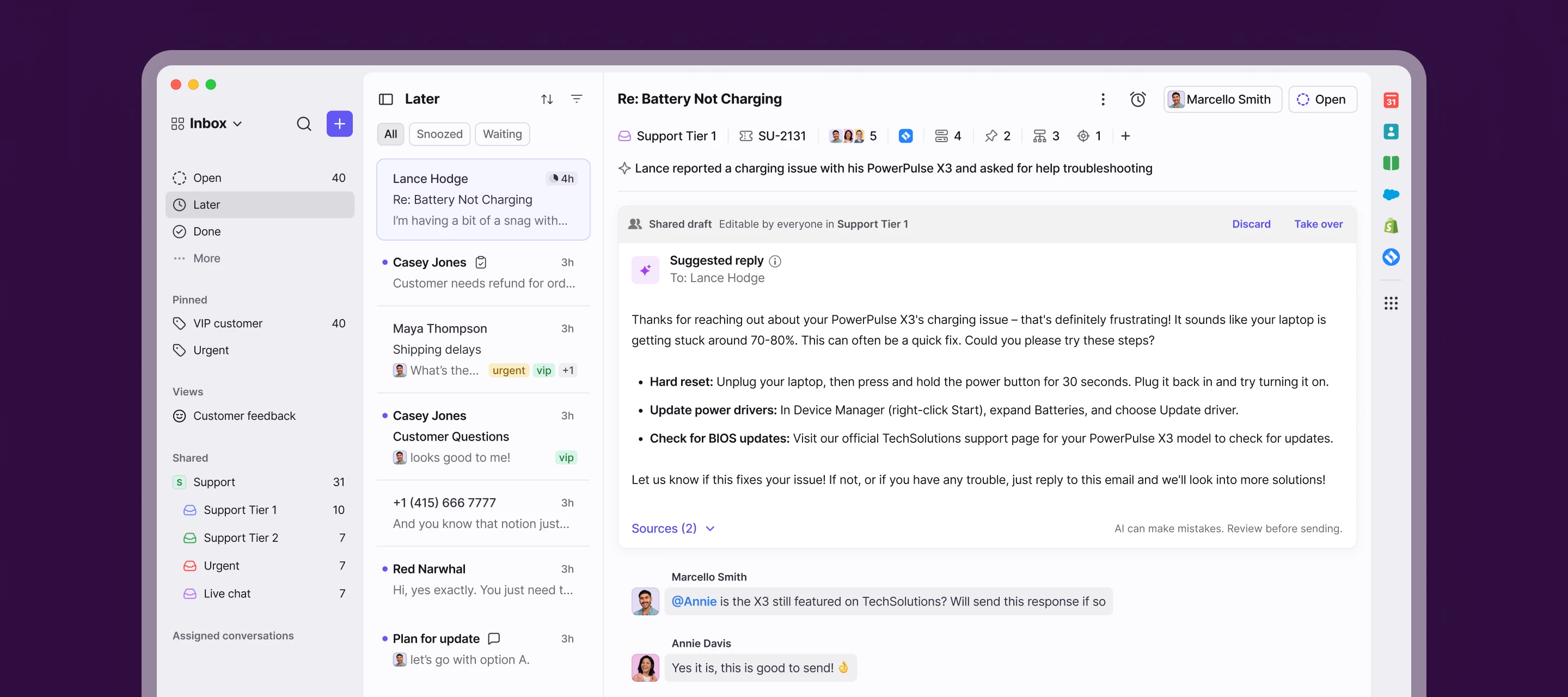
We’re launching a new, streamlined inbox experience to simplify daily workflows and keep your team focused with clearer prioritization and faster context.

Here’s what’s new:

  • Open, Later, and Done sections bring order to your queue
  • Simplified conversation header gives you context at a glance
  • Collapse your sidebar to get into "focus mode"
  • Speed through your inbox with more discoverable shortcuts

Join the beta group for inbox design updates and help shape the inbox experience.

    75 replies

    Jose Luna
    Conversationalist
    July 15, 2025

    Hi there,
    I noticed the recent update, great work overall! I did want to ask: are we no longer able to access archived emails in personal (non-shared) channels the way we could before, by simply clicking on Archived?

    Personally, I found the previous setup much more efficient, being able to quickly access Archived, Trash, Spam, and Snoozed without going through advanced search saved a lot of time. The new method feels like it requires more steps for what used to be simple, everyday actions.

    Just wanted to share that feedback in case others feel the same. Thanks!

    Shared Channels
    My Own Channels 


    lleeser
    Conversationalist
    July 15, 2025

    Couple Questions- 

    Where is the Search that used to be at the top of the page? 

    Also, Tagging is something that will be a big change and not as quick as previous version.  Its a three step process version when you click on the TAG the dropdown would appear first. 

    futureproof
    Helper
    July 15, 2025

    🔥 Loving the new design! Obvious that a lot of thought and work was put into it. Congrats!

    My couple of questions:

    • Will the Front UI Kit for developers be updated to match the new design style?
    • Will the mobile apps design be updated soon too?

    😊

    futureproof
    Helper
    July 15, 2025

    @lleeser You can open search by selecting the search icon at the top left of your inbox. Try using keyboard shortcuts though, they’re much faster. Just press / or Shift + F to open search instantly.


    bdominguez
    Conversationalist
    July 15, 2025

    Hello ​@meganbeatty!

    You say I can find the discussions in Open inbox, but it’s empty. When I switch back to the previous version, I can see the discussions I had. How can I view them here?

    meganbeatty
    Fronteer
    July 15, 2025

    Hello ​@meganbeatty!

    You say I can find the discussions in Open inbox, but it’s empty. When I switch back to the previous version, I can see the discussions I had. How can I view them here?

     Hi ​@bdominguez - I recommend reaching out to support@front.com so that they can help here, but all of your open discussions should be found under the Open > Discussions tab. Snoozed Discussions will be in Later and Archived Discussions will be in the Later section. 

    bdominguez
    Conversationalist
    July 15, 2025

    Thank you ​@meganbeatty , but in “Later” or “Done” section it's not possible to distinguish the Discussions section, like you can in “Open”. Is there a way to filter discussions in “Later” or “Done”?


    jacob_bragg
    Conversationalist
    July 15, 2025

    Hi there,

    Will we be able to customize the ribbon/toolbar at all? I’m frustrated that the trash and tag buttons are now nested within dropdown menus. Some other commenters have touched on this already. The ability to add additional items to this empty space would be fantastic.


    And I just want to add, it seems to me that your team mistook a clean design for an efficient/convenient one, as so often happens with redesigns. I appreciate that the new inbox may be a great improvement for some, but for others (myself included) it just seems that certain features were sacrificed in the name of an attractive UI.

    Jose Luna
    Conversationalist
    July 15, 2025

    Hi there,

    Will we be able to customize the ribbon/toolbar at all? I’m frustrated that the trash and tag buttons are now nested within dropdown menus. Some other commenters have touched on this already. The ability to add additional items to this empty space would be fantastic.


    And I just want to add, it seems to me that your team mistook a clean design for an efficient/convenient one, as so often happens with redesigns. I appreciate that the new inbox may be a great improvement for some, but for others (myself included) it just seems that certain features were sacrificed in the name of an attractive UI.

    I completely agree, and I really hope the team considers bringing back some of the previous functionality, or at least offering customization options, as you suggested, so we can tailor the interface to fit our workflows. It’s especially frustrating that core actions like tagging, trashing, or accessing Archived now take extra steps, which slows things down for those of us who depend on speed and efficiency in our daily use.

    Orianne
    Conversationalist
    July 16, 2025

    We've been testing the new UI and wanted to share some feedback based on our team's experience. While we appreciate the improvements you're aiming for, we’ve run into several usability challenges that impact our workflow:

    • Message colors: Internal and external messages now use the same color, making them hard to distinguish at a glance. Same for Light and Dark mode.

    • Contrast issues: In both light and dark mode, the overall color palette lacks contrast compared to the old version. This makes it harder to differentiate sections and leads to faster eye fatigue.

    • Composing emails: It now takes two clicks to start composing a message, adding friction to a frequent action.

    • Folder access: Visibility into folders like Spam and Trash has decreased — more clicks are required to access them.

    • Tag management: When adding many tags, the list drops down in a way that makes it hard to manage; you often end up ticking and unticking the same tags.

    • Participants visibility: It’s harder to see who’s involved in a conversation.

    • Subject line visibility: The subject is partially hidden unless the sidebar is collapsed.

    • Inbox layout: In the “Inbox Open” view, we’d love the ability to customize what’s shown (e.g., hiding Tasks or Discussions that we don’t use).

    • Finding duplicates: The smaller preview makes it harder to spot duplicate conversations.

    • Settings & workspaces: These now require multiple clicks to access, slowing down navigation.

    • Knowledge Base editing: The option to edit articles directly seems to be missing.

    • Scrolling: Previously, inboxes and views were visible without scrolling — now we have to scroll down, adding friction.

    • Unread messages: They’re harder to spot than before.

    • Tag colors: These are now less visible and harder to distinguish quickly.

    • Preview visibility: Tags and ticket statuses are less visible or completely gone.

    • Inbox color cues: The color that used to appear in the top-right corner of a message (showing which inbox it was in) has disappeared — this was very useful.