
conniechen
Fronteer
November 6, 2025

Introducing a new app switcher

  • November 6, 2025
  • 33 replies
  • 1471 views

The first feature we’d like your feedback on is a new version of the app switcher. This app switcher gives your team easy access to all the core Front apps like Inbox, Calendar, Analytics, Contacts, etc.


➡ Try out the prototype in your browser with this link 

And here’s a video to walk you through the prototype.


As a reminder, this is the current app switcher experience.
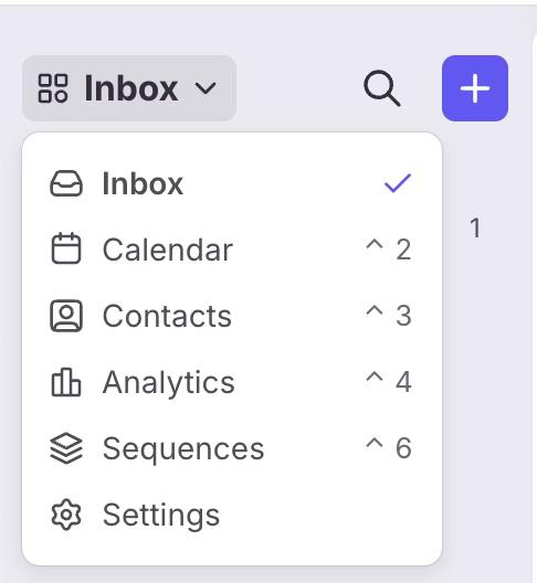
Current Front app switcher

And this is the new experience we’re working on. 
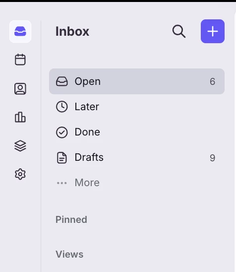
Proposed Front app switcher

What do you think? Please provide any and all feedback in the comments below. Some guiding questions to get you thinking:

  • How does this app switcher compare to the current app switcher?
  • How does this app switcher compare to using shortcuts to navigate?
  • Does this app switcher improve the efficiency of your workflows or commonly used actions?

And finally, if you’d like to try this feature out in your Front account, let me know. 

Thanks, excited to hear your feedback!

    33 replies

    mason
    Conversationalist
    November 13, 2025

    I like the current way personally, super intuitive and saves on horizontal space

    michael_clark
    Conversationalist
    November 13, 2025

    I’ve got used to the new way, but having the icons without need for keyboard command or two clicks seems better.  To the point made by Mason, what if the icons could live in the are currently occupied by the drop down, thus both saving horizontal space, and removing the need to hide the various apps in a drop down..? 


    rmace
    Conversationalist
    November 13, 2025

    I too have some concerns about the horizontal space as I tend to keep Front open on one screen with another app to the left of it. However, I am not a fan of having to click multiple times to navigate. I would be very eager to try this out on my Front account if you can enable it for me. Having easy one click navigation for me outweighs the small horizontal loss of space. 

    ericfrisch
    Conversationalist
    November 13, 2025

    I like this new design, but I also haven’t minded using the keyboard to navigate in the current experience. Could the keyboard shortcuts be retained even if new icons are added?

    caitlin.crouse
    Conversationalist
    November 13, 2025

    I preferred the original layout with the icons across the top menu so we don’t impact horizontal space. However, I like this much better than I like the current dropdown. My team and I all use analytics and calendar heavily and the dropdown is a pain point. Personally, this change was implemented while i was on leave, but I’ve been back for 2 months now and I’m still not used to it. It just doesn’t feel intuitive, especially with settings separated out.

    I really like mail, calendar, analytics, and settings being in a line together (even with the space separating settings)

    grit_evy
    Conversationalist
    November 13, 2025

    How does this app switcher compare to the current app switcher?
    The current dropdown switcher is functional, but not ideal for our team. It takes some getting used to, especially for users who work at a fast pace and are accustomed to clicking icons directly to move between menus. The new design with icons on the side is preferable since it’s more intuitive and reduces the number of clicks needed to navigate. 

    How does this app switcher compare to using shortcuts to navigate?
    Our team has a mix of users, some prefer keyboard shortcuts, while others rely heavily on the mouse. Shortcuts are always a great alternative, especially when there are mouse issues or for users who prefer keeping their hands on the keyboard. The key is flexibility.

    Does this app switcher improve the efficiency of your workflows or commonly used actions?
    Yes, the improved app switcher saves a click and streamlines navigation. Even small efficiency gains add up over time, so that’s a meaningful improvement for daily workflows.

    christina_bishop
    Conversationalist
    November 13, 2025

    I definitely like the new version better!  Agree with some other commenters that maybe along the top would retain horizontal screen space.

    brandon_lockhart
    Conversationalist
    November 13, 2025

    I really like having the icons back, but it sems to restrict the already in high demand horizontal space. Could this new left hand sidebar be eliminated and the icon configuration be rotated to instead restrict vertical space? 


    nsmith
    Conversationalist
    November 13, 2025

    Personally I like that it wouldn’t take two clicks to access the other apps (particularly settings), but I do share the horizontal space concerns—if it’s possible to compromise, that’s great, but if not, then I don’t have a strong opinion for or against the current and proposed.

    I haven’t really been using the keyboard shortcuts, though, primarily because I’m mainly only accessing settings regularly and sequences on occasion.

    anthonyv
    Conversationalist
    November 13, 2025

    This re-design makes a lot more sense. In the current UI the issue with the collapseable sidebar (which is a great focus mode) is that you lose access to all of your calendars, contacts etc.

    This keeps the menu icons available whilst taking up minimal horizontal space. 
    Much cleaner approach.