Question

Layout Functionality

  • November 14, 2025
  • 4 replies
  • 54 views

Andreas

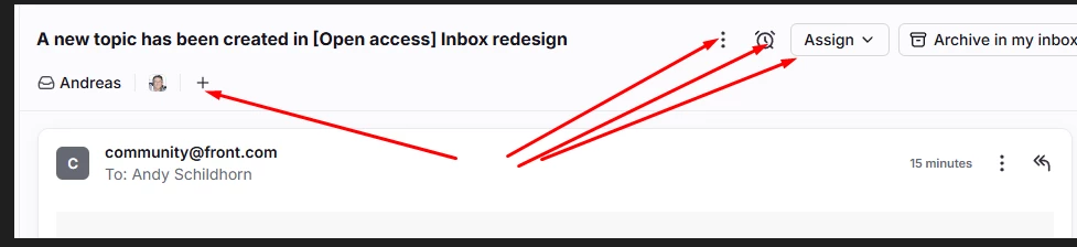
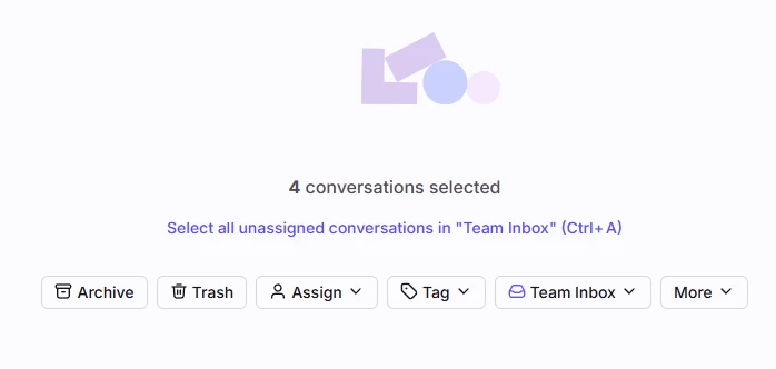
I am finding that the layout for handling emails very cumbersome. Click here to add a tag, Over here to trash the email. 

Need to move and dig deeper to get where I am going. The icons are not uniform and so I am always double-clicking. Two clicks to trash or add a tag makes no sense.
When I select more than one email, all the icons are lined up well and intuitively. Why can we not have the same at the top of the emails and not scattered and in a different form


4 replies

anthonyv
Forum|alt.badge.img
  • Conversationalist
  • 9 replies
  • November 14, 2025

I think this is just a personal preference. I think the current layout makes sense, and would not like for it to be replaced by a series of large buttons all horizontally stacked together


Kim P
Forum|alt.badge.img
  • Conversationalist
  • 4 replies
  • November 14, 2025

I highly recommend using the shortcuts (i.e. T for tag, E for archive, S for snooze, etc.). I rarely click on the icons; I just use the shortcuts. 


Andreas
  • Author
  • Conversationalist
  • 4 replies
  • November 14, 2025

For me, I am probably click 20% more than required when going through 30 or 40 emails. It does get a bit tiring. Simple layout with quick access. Do not really care what it looks like. Functionality over form. Yes I was told to use shortcuts by the help desk. If it is something you do not do on a regular basis then it does not work.


Emma
  • Conversationalist
  • 1 reply
  • November 14, 2025

It would be really great if we had the option to select which icons displayed for us. This would enable us to select the icons we use the most (tags and trash in my case) without clogging up the screen.