Question

Contrast between Read and Unread

  • December 5, 2025
  • 4 replies
  • 25 views

allenk
Forum|alt.badge.img+3

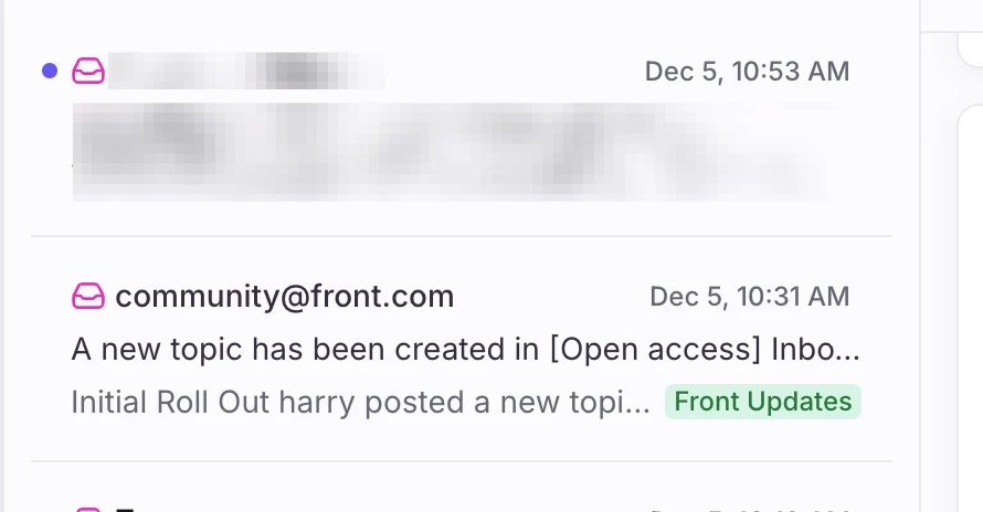
Is there the potential for re-introducing some contrast between read and unread emails? Currently the only signifier that something is unread is the little blue dot for the message. In the previous UI the entire box was shaded so you could easily see your read vs unread.


I’d love to be able to glance at my inbox and more quickly distinguish between read and unread with the some color variation for the entire email preview.

Every email platform I’ve used has provided that, and it feels like it would be easy to bring that back, even with a toggle.


4 replies

rmace
Forum|alt.badge.img+4
  • Conversationalist
  • December 5, 2025

I think that would be nice too. The dots don’t bother me and I’m used to them, but a little contrast would make things more visible for sure. 


harry
Forum|alt.badge.img+6
  • Helper
  • December 5, 2025

Yeah, contrast is good. Contrast is one of my suggestions in the survey. We have gray and gray with white or dark mode. One is muted the other stark, there must be a middle ground.


conniechen
Forum|alt.badge.img+5
  • Fronteer
  • December 5, 2025

Thanks for sharing! This is something we’re continuing to look at. I’ll also be taking into account the survey feedback when we do roadmapping so sharing there is great if this is a really big blocker for you.


anthonyv
Forum|alt.badge.img+1
  • Conversationalist
  • December 6, 2025

For what it’s worth, my take on the “unread” identifier is that I like that it is subtle. We try to instill in staff that they should be reading the email once and then actioning straight away. If it needs to be completed now then complete it, if it can’t be completed until later then Snooze it to the appropriate time.