
Another version of the app switcher!

  • November 14, 2025
  • 20 replies
  • 507 views

conniechen
Forum|alt.badge.img+5

I shared designs for a new app switcher last week in this post. Based in part on some of the feedback we received, we’re exploring a second direction, which increases the functionality available in focused (collapsed sidebar) mode. Let me know how this one compares!


➡ Try out the prototype in your browser with this link 

📹 Video walkthrough here


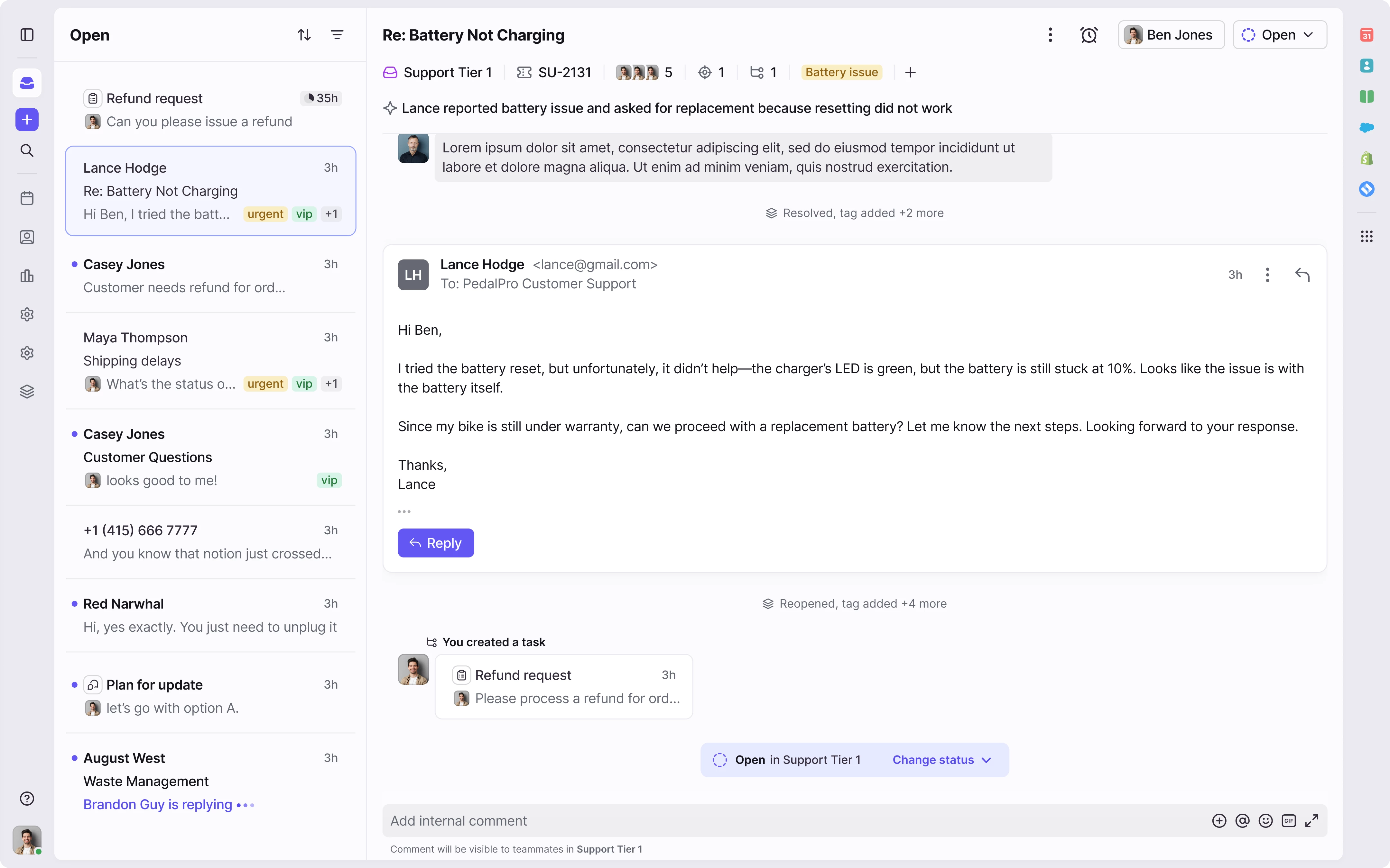
Looking forward to your feedback!

20 replies

rmace
Forum|alt.badge.img+4
  • Conversationalist
  • November 14, 2025

I like this, but we wouldn't be able to use it my company. We have multiple workspaces that we need to monitor and reply to all emails within 10 minutes or less. So having the workspaces always showing is critical for us. 

If you could add in the option to pin workspaces/inboxes/tags and see message counts that would be amazing and super useful for our teams. 


Kim P
Forum|alt.badge.img+1
  • Conversationalist
  • November 14, 2025

I agree with ​@rmace. In my role, I like this interface but in reality a CSR or more task focus needs to be able to navigate between different inboxes, tags, views, etc. Having the option to even pin (7) inboxes, tags or views to the bar would make this a more viable option for most users. 


anthonyv
Forum|alt.badge.img+1
  • Conversationalist
  • November 14, 2025

I think the addition of the search and new message is a great addition for those that like to work in collapsed mode.
I think the hover over inbox is unnecessary and would detract from the experience, as would be inadvertently activated regularly when moving toward the search or new message. Being able to access these by expanding the sidebar would be sufficient I believe.

It would be worth considering how this approach can be expanded to the other apps. For example, calendar also has a + option for creating new entries and contacts has a search feature. I wonder if a more uniform approach could be found that could carry these elements across apps (and in doing so allowing for collapsed views of the other apps at the same time)


grit_evy
Forum|alt.badge.img+4
  • Conversationalist
  • November 14, 2025

In theory, I really like the collapsed view option. However, I agree with the others, my team needs to stay constantly vigilant across all shared inboxes, not just the open one, since we primarily operate within the shared workspace inboxes directly. For us, this feature would really only be beneficial for the senior leadership team.


Liz
Forum|alt.badge.img+4
  • Conversationalist
  • November 14, 2025

Our company would not use the collapsed view ourself as we must monitor Shared Inbox counts and individual load balancing.


cait_a
  • Conversationalist
  • November 14, 2025

we also will not use the collapsed view as we monitor several inboxes and tags at once 

I do like the above idea of being able to pin the most used individually 


brandon_lockhart
Forum|alt.badge.img+4

The collapsed sidebar would not be productive for our company’s use case either. We need to monitor the number of items in inboxes. Rules work well for sorting but there are always items that slip through the cracks that need manually addressed. 


conniechen
Forum|alt.badge.img+5
  • Author
  • Fronteer
  • November 14, 2025

Thanks for all the feedback. Please continue to share more examples of how users are navigating in the sidebar!

Our goal of having the collapsed sidebar is to allow users to deeply focus on the current queue of conversations. Maybe that’s just 5-10 minutes at a time, but it allows you to knock out those messages without distraction. Then, you can simply use the hover interaction to move to another place. 

What I’m hearing from you is that there is actually even more vigilance needed most of the time, with pretty constant monitoring required across tags, views, inboxes, and workspaces. For those workflows, the sidebar remains the same as today.

Are there any users in your organization who would benefit from using a collapsed sidebar? What do their workflows look like? @grit_evy gave a good example of the senior leadership team.


gareth_butcher
Forum|alt.badge.img+4
  • Conversationalist
  • November 19, 2025

The new app switcher looks great for helping our team stay focused and cut out distractions.
We use a workflow where staff check their inbox at set times, quickly archive/snooze/respond, and then star any tasks they must complete before their next inbox check.
They then work exclusively from Assigned to Me → Starred, which keeps them focused and productive.

Two additions would make this even more powerful:

  1. A one-click “Starred Only” filter button (so users can instantly jump into their priority tasks)

  2. An option to auto-remove the star when a conversation is snoozed or archived (to prevent old starred items lingering and cluttering their task view)

These would streamline focus workflows and help teams maintain clean, accurate task lists throughout the day.


frankbodi
Forum|alt.badge.img+1
  • Fronteer
  • November 20, 2025

Thanks ​@gareth_butcher, glad this will be helpful. So your team uses Starred as a way to prioritize/order messages within their Assigned to Me queue?


gareth_butcher
Forum|alt.badge.img+4
  • Conversationalist
  • November 20, 2025

yes ​@frankbodi , we use this as a temporary prioritisation


Caroline
Forum|alt.badge.img
  • Conversationalist
  • November 28, 2025

I really like the option to collapse the sidebar. Several of our teammates often work in focus mode, and being able to collapse it would make it easier to use Front alongside another interface, which is often the case for us, while still keeping all the information needed to reply to the ongoing conversation.


samsheridan
Forum|alt.badge.img+6
  • Helper
  • November 28, 2025

As an admin I have access to a bunch of inboxes and stuff that I rarely use, but don’t want to have to add/remove from my sidebar whenever I do want to see them. The UI looks really good in the collapsed view, especially with these additional buttons, but it isn’t very helpful for me right now.

There are just a few shared inboxes and sidebar items I actually use. If I could just pin, for example: Open, Later, Drafts, Sent, Trash, Spam, Shared Inbox A, Shared Inbox B to the collapsed sidebar, I’d almost never even need the expanded sidebar again. I understand that the hover action was meant to solve this but it’s really clunky to use quickly with a mouse, especially since the menu disappears if you slightly overshoot the top of the Open view (seems to be a bug in the current preview version). My slower colleagues might not mind since it’s otherwise a really usable layout, but I don’t think I’d get used to it.

The new vertical button stack is the least useful part of the entire UI for me. At most, I use Inbox, Calendar, Contacts, and Settings, so the other five or more buttons on the far left are clutter, and I’d rather be using that space for the actual inbox sidebar. I see I’m not able to resize that sidebar very much anymore, so I can’t make it as small as the content. If I could compress that to just icons and optionally the numbers next to the inboxes, that’s all I would use. Hence, being able to pin a bunch of things instead of using the hover would work really well for me.

The far-left stack makes sense because all of the other UI elements are different outside of the inbox. For consistency this is the most logical way of putting it together. To make it useful when the other menu is collapsed, you’d just need be able to customize it more. The numbers don’t work very well here but this is sort of what I want to be able to do:


conniechen
Forum|alt.badge.img+5
  • Author
  • Fronteer
  • December 2, 2025

@samsheridan Thanks for the detailed feedback! I think I understand what you’re trying to do, which is a combination of core navigation and using that area to pin frequently used areas. Regarding this “I’d rather be using that space for the actual inbox sidebar” - what did you envision as a way to combine the navigation icons while retaining space for the sidebar? Or is this just a general comment on space-saving? 


samsheridan
Forum|alt.badge.img+6
  • Helper
  • December 2, 2025

Ah, I just meant that I spend 99% of the time in the inbox, using the inbox sidebar, so the navigation sidebar is nice and small and consistent for the other pages, but I wouldn't actually click any of its buttons very often. This is fundamentally better than the old design though. I think I started using the hotkeys instead of the old design somewhere along the way.


anastasiia_p
Forum|alt.badge.img
  • Conversationalist
  • December 3, 2025

In my work this will be an inconvenient feature. For our company it's important to always have inboxes open so we can monitor them and respond quickly. This way, it'll be hidden and I'll have to check it manually every time.


rmace
Forum|alt.badge.img+4
  • Conversationalist
  • December 3, 2025

In my work this will be an inconvenient feature. For our company it's important to always have inboxes open so we can monitor them and respond quickly. This way, it'll be hidden and I'll have to check it manually every time.

You will still be able to have the sidebar expanded to see all your inboxes. In fact, they are working to add a new option that allows you move sections up and down within the sidebar. So you’ll be able to move Views, Workspaces, etc. up and down to better adjust to your needs. The collapsed sidebar is just an optional feature. 


anthonyv
Forum|alt.badge.img+1
  • Conversationalist
  • December 8, 2025

@conniechen am liking the new addition of the “+” (new message) and “search” icons into the collapsed sidebar view. Makes it easy to quickly perform these actions with mouse without having to re-expand the sidebar.

Only suggestion I would have is to move the icons above the “inbox” icon (rather then below), and then have these buttons activate without the pop-over from the sidebar.

At the moment when you go to activate the buttons, the sidebar pops over at the same time. Ideally would like this not to occur for these functions as there is no other interaction that the sidebar provides for the features.


conniechen
Forum|alt.badge.img+5
  • Author
  • Fronteer
  • December 8, 2025

@anthonyv What benefit do you see of the icons being above the inbox? Also we are working on fixing that expand interaction to only trigger on the inbox icon and the actual expand/collapse icon. Thanks for trying it out!


anthonyv
Forum|alt.badge.img+1
  • Conversationalist
  • December 8, 2025

@conniechen it was only if this made it simpler to limit the expanded sidebar to be limited to the main icons (so to group them all together). But if plan is to limit based on hover location to the specific icons then that would solve the problem