

Today we’re announcing an all-new Front: with powerful new AI tools that keep you in control of your customer experience, and a sleek new inbox experience built for speed and clarity. Together, they enable teams to resolve faster, simplify daily workflows, and increase focus — all the efficiency gains of AI without sacrificing the quality of service they’re known for.
Here’s what’s new:
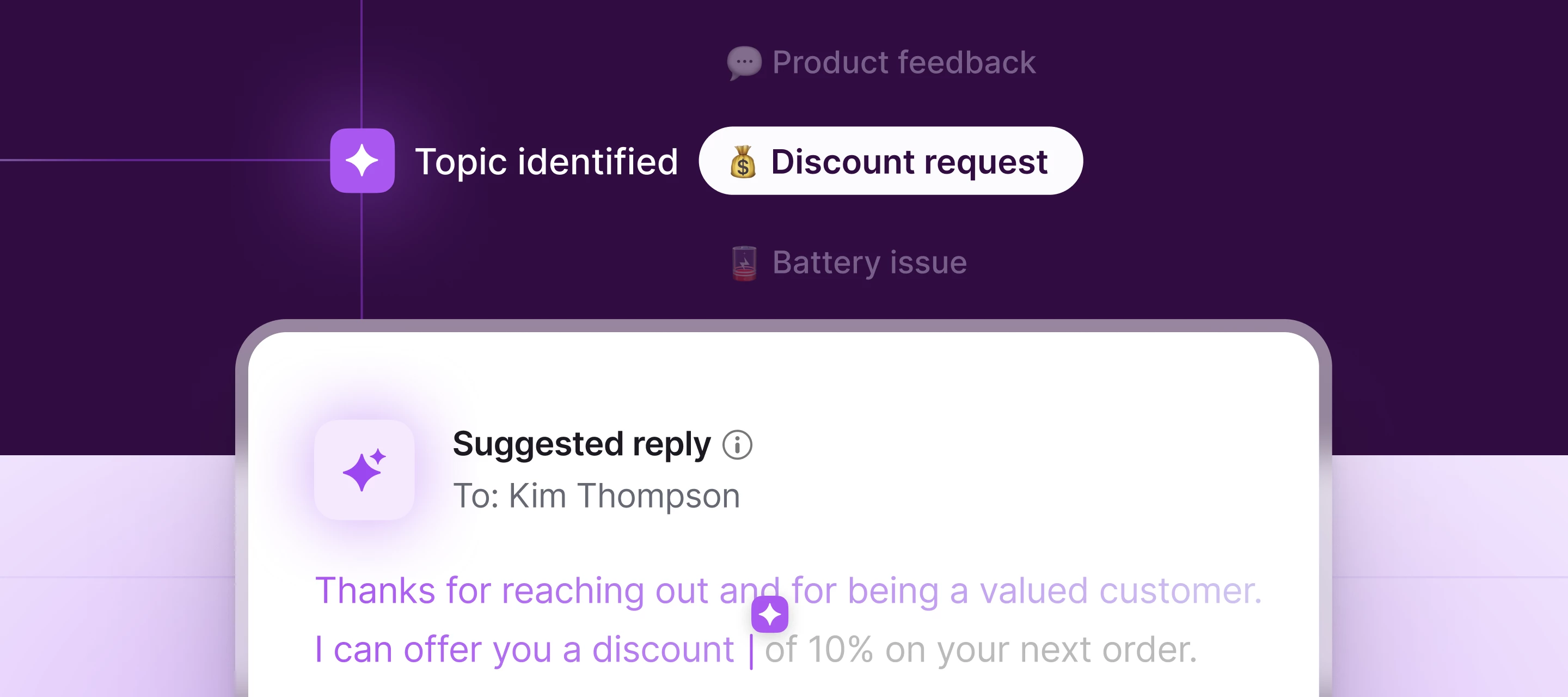
- Topics: Simply connect a channel or select your preferred inboxes and Front AI will auto-categorize conversations for smarter routing and actionable insights.
- Copilot: Speed up resolution times with suggested replies based on past conversations and help content.
- Smart CSAT + Smart QA: Get a complete picture of your CX and agent performance - no surveys or manual scorecards required.
- Agent (coming soon): Maintain full control of automatic resolutions by directing which customer interactions AI handles autonomously and which get escalated to humans. Sign up here to express interest in participating in the beta and we'll reach out as we have capacity.
- Reimagined inbox: Give your teams faster context, simplified workflows, and increased focus with a new streamlined inbox experience.
Learn more about our powerful Front AI tools and new inbox experience in our blog.
Join the beta group for inbox design updates and help shape the inbox experience.


